PubNub Service Blueprint
Customer journey mapping tool — adopted by 5 teams, generated 20+ journey maps, +18% customer satisfaction
Built a service blueprint tool that unified fragmented customer experience visibility. 5 teams adopted it, 20+ journey maps created, 40+ improvement initiatives launched, resulting in 18% customer satisfaction improvement.
The Problem
Every team saw their slice of the customer journey but no one saw the whole picture. Customer pain points fell between team boundaries, improvement efforts conflicted, and institutional knowledge disappeared when people left.
I discovered this problem while working on another project. I asked a simple question: "What happens after a customer signs up?" Five people gave me five different answers. None were complete. All were partially wrong.
The Symptoms
| Symptom | Root Cause |
|---|---|
| Customer complaints "fell through cracks" | No owner for cross-team touchpoints |
| Improvement efforts sometimes conflicted | Teams couldn't see each other's work |
| Onboarding knowledge was tribal | Nothing documented, lost when people left |
| Same issues kept resurfacing | No systematic tracking of pain points |
"I've been here 4 years. I could draw you the journey from memory. But if you ask me to prove it, I can't. It's all in my head."
My Role
I owned:
- Concept development and product vision
- Blueprint structure and information architecture
- Collaboration features design
- Pain point tracking system
- Rollout and adoption strategy
I collaborated with:
- PM on prioritization and resource allocation
- 2 engineers on technical feasibility
- CS team as primary users and domain experts
Important context: This was a self-initiated project. I identified the problem, pitched the solution, and got approval to build it. It wasn't assigned — it was advocated.
Research
Stakeholder Interviews
Week 1-2Interviewed 26 people across the organization. 10 PMs, 8 customer success managers, 5 engineers, 3 executives. The question: "How do you understand what customers experience?"
Artifact Archaeology
Week 2Collected every existing journey artifact I could find: Miro boards, slide decks, spreadsheets, wiki pages. Found 14 different "journey maps" with conflicting information. None were maintained.
Pain Point Inventory
Week 3Catalogued where customer issues were tracked: Jira, Slack, spreadsheets, email threads, people's notebooks. No single source of truth. No way to prioritize.
The Four Insights That Shaped Everything
Each team saw their touchpoint clearly but couldn't see upstream or downstream. Solution: Unified visualization that shows the full journey, not just your slice.
Issues were tracked in 6+ different systems. Impossible to see patterns or prioritize. Solution: Centralized pain point tracking directly on the journey.
Teams couldn't prioritize because there was no way to compare severity across different touchpoints. Solution: Impact scoring framework (severity × frequency).
Good ideas from journey mapping sessions never got implemented. The insight → action gap was huge. Solution: Built-in task management with assignments and deadlines.
Design Solutions
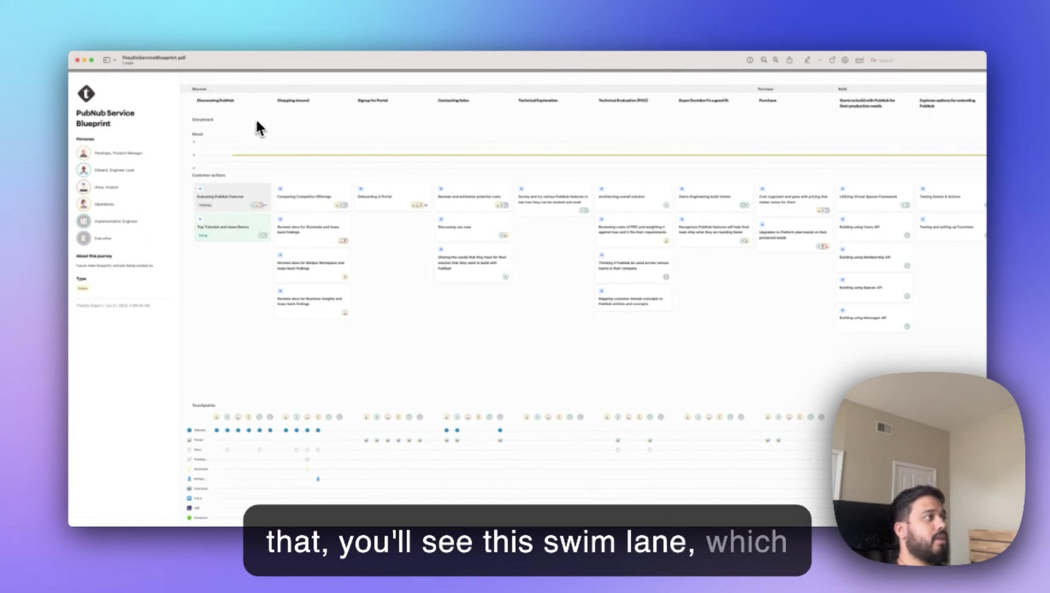
Multi-Lane Blueprinting
Service blueprint structure that shows the full picture — what customers do, what they see, what happens behind the scenes.
Service Blueprint
Purchase Flow| Lane | What It Shows |
|---|---|
| Customer Actions | What the customer does at each step |
| Frontstage | Visible interactions (UI, support, emails) |
| Backstage | Behind-the-scenes work (internal processes) |
| Systems | Technical infrastructure supporting each step |
Why four lanes: Early prototypes had six lanes. Testing revealed cognitive overload. Four lanes hit the sweet spot — comprehensive without overwhelming.
Real-Time Collaboration
Multiple people editing the same journey simultaneously. No more "can you send me the latest version?"
Real-time Collaboration
Key features:
- Simultaneous editing (like Google Docs)
- Presence indicators (who's viewing, who's editing)
- Threaded comments for discussions
- @mentions for notifications
- Version history with rollback
The collaboration insight: Journey mapping isn't a solo activity. The value comes from cross-functional input. If collaboration is hard, people work in silos — defeating the purpose.
Analytics Integration
Overlay real data on the journey map. Stop guessing where customers struggle.
Analytics Overlay
What we connected:
- Drop-off rates from Mixpanel/Amplitude
- NPS scores by touchpoint
- Support ticket volume by journey stage
- Time spent at each step
The "aha" moment: When teams saw real drop-off data overlaid on their assumed journey, discrepancies emerged. The journey they thought customers took wasn't the journey customers actually took.
Pain Point System
Visual markers on the journey with impact scoring for prioritization.
Pain Points
Slow results on mobile
Images slow to load
23% cart abandonment
Limited payment options
| Feature | Purpose |
|---|---|
| Visual markers | Easy to spot issues at a glance |
| Impact scoring | Severity × frequency = priority |
| Severity levels | Quick triage (P1-P4) |
| Trend tracking | Is it getting better or worse? |
| Owner assignment | Clear accountability |
How scoring worked: Severity (1-5) × Frequency (1-5) = Impact score. P1 pain points (score 20-25) got executive visibility. This simple framework ended debates about prioritization.
Action Planning
Turn insights into tasks without leaving the tool. Close the insight → action gap.
Action Items
0 tasks createdWhat made it work:
- Create tasks directly from pain points
- Assign to specific people with deadlines
- Track resolution status
- Slack notifications when assigned
- Reporting on initiatives launched vs. completed
The Hard Parts
Convincing People to Use Yet Another Tool
The biggest risk was adding to tool fatigue. People already had Miro, Notion, Jira, Confluence. Why would they use this?
My strategy: Don't compete on features. Compete on integration.
- Journey maps pulled data from existing tools (no re-entry)
- Tasks synced to Jira (not a separate backlog)
- Notifications went to Slack (no new notification system to check)
- Comments appeared in team channels (visibility without context-switching)
Result: Adoption felt like enhancement, not replacement.
The Template Debate
Some stakeholders wanted a single canonical journey template. Others wanted total flexibility. Both had valid points.
The compromise: Template library with customizable starting points. Teams could fork templates, modify them, and share variants back. Standards emerged organically rather than being mandated.
Results
Adoption
| Metric | Result |
|---|---|
| Product teams using | 5 of 7 (71%) |
| Journey maps created | 20+ |
| Active monthly users | 85% of target teams |
| Average session time | 45 minutes |
Business Impact
| Metric | Result |
|---|---|
| Improvement initiatives launched | 40+ |
| Customer satisfaction | +18% |
| Time to identify issues | Weeks → Hours |
| Cross-functional alignment | "First time we all see the same thing" |
"For the first time, everyone can see the full picture. We stopped arguing about priorities because the data is right there on the journey."
"We found issues we never knew existed. Pain points that fell between teams are now visible and owned."
What I Learned
No one asked for this tool. I had to sell the problem before I could sell the solution. That meant data — the 14 conflicting journey maps, the scattered pain points, the recurring issues.
The blueprint metaphor resonated immediately. People understood service blueprints from other contexts. I didn't have to teach the concept, just the tool.
The tool succeeded not because it was powerful, but because it connected to everything people already used. Standalone tools die. Integrated tools become infrastructure.
I'd build the analytics integration first, not last. The "real data on assumed journey" moment was the most powerful adoption driver. I saved it for V2 when it should have been V1.
What's Next
Future improvements:
- AI-suggested improvements based on journey patterns
- Automated pain point detection from support tickets
- Live NPS/CSAT overlay (not just periodic)
- Journey comparison (before/after redesigns)
- Executive dashboard with journey health scores
Gallery
