Paycom Org Insights — Workforce Planning
Unified siloed HCM data into a real-time workforce planning tool — reduced client setup from 2+ weeks to hours
Summary
Designed Paycom's first workforce planning tool — replacing weeks of manual data exports with live scenario modeling. Reduced client setup time from 2+ weeks to hours, now piloting across 3+ market segments.
The Problem
HR, Finance, and Executive teams couldn't plan their workforce using the HCM platform they paid for. Instead, they spent 2+ weeks exporting data into spreadsheets and third-party tools — data that went stale the moment it left the system.
Paycom has deep, rich data about every employee — positions, compensation, reporting structures, performance. But that data was locked in silos. When an HR director needed to model "what if we add 10 engineers in Q3?" they had to:
- Export org data from Position Management
- Export compensation data from Payroll
- Export headcount data from HR
- Manually combine in Excel
- Build financial models in a separate tool
- Present findings that were already outdated
The irony: Customers were paying for a unified HCM platform, then doing the unification themselves in spreadsheets.
My Role
This project had significant organizational complexity — two development teams, multiple Senior PMs, a Director, and engineering leadership all had stakes. Here's how I navigated it:
I owned:
- End-to-end experience design for the planning tool
- Information architecture connecting cross-module data
- New visualization patterns for org charts and financial impact
- Stakeholder alignment across teams (road-showing, decision documentation)
I collaborated with:
- Mid-level UX designer on specific flow details and research synthesis
- Data team on what data was available and how it connected
- Engineering on performance constraints for large org visualizations
I did NOT own:
- Backend data architecture (engineering)
- Business requirements prioritization (PM/Director)
- Go-to-market and pilot selection (Product leadership)
Starting in Ambiguity
Week 1, I didn't know what this product was. Nobody did. The brief was: "Help our customers plan their workforce without leaving Paycom."
How I Found Clarity
Instead of waiting for requirements, I started mapping:
Data Flow Mapping
Week 1-2I traced how workforce data flowed between modules — Position Management, Payroll, HR, Benefits. I found 14 different places where "headcount" was defined, each slightly different. The product couldn't work until we had a single source of truth.
Workaround Archaeology
Week 2I catalogued the external tools customers were using as workarounds. Excel was universal. Some used Anaplan, others Workday Adaptive Planning. The patterns revealed what they actually needed: see current state, model future state, understand financial impact.
Stakeholder Interviews
Week 2-3Talked to 8 customers in different segments. The CFO perspective was different from the CHRO perspective was different from the HR generalist perspective. But they all shared one frustration: "Why can't I just do this in Paycom?"
Customers didn't want a "planning tool." They wanted confidence. Confidence that the data was accurate. Confidence that their projections were sound. Confidence to present to the board without caveats. Every design decision traced back to: does this build or erode confidence?
Design Principles
Three principles guided every decision:
| Principle | What It Meant in Practice |
|---|---|
| Centralize | No more exports. All data in one place, always current. |
| Build Confidence | Show data sources. Explain calculations. Make assumptions visible. |
| Assist and Suggest | Surface insights proactively. Don't make users hunt for patterns. |
Design Solutions
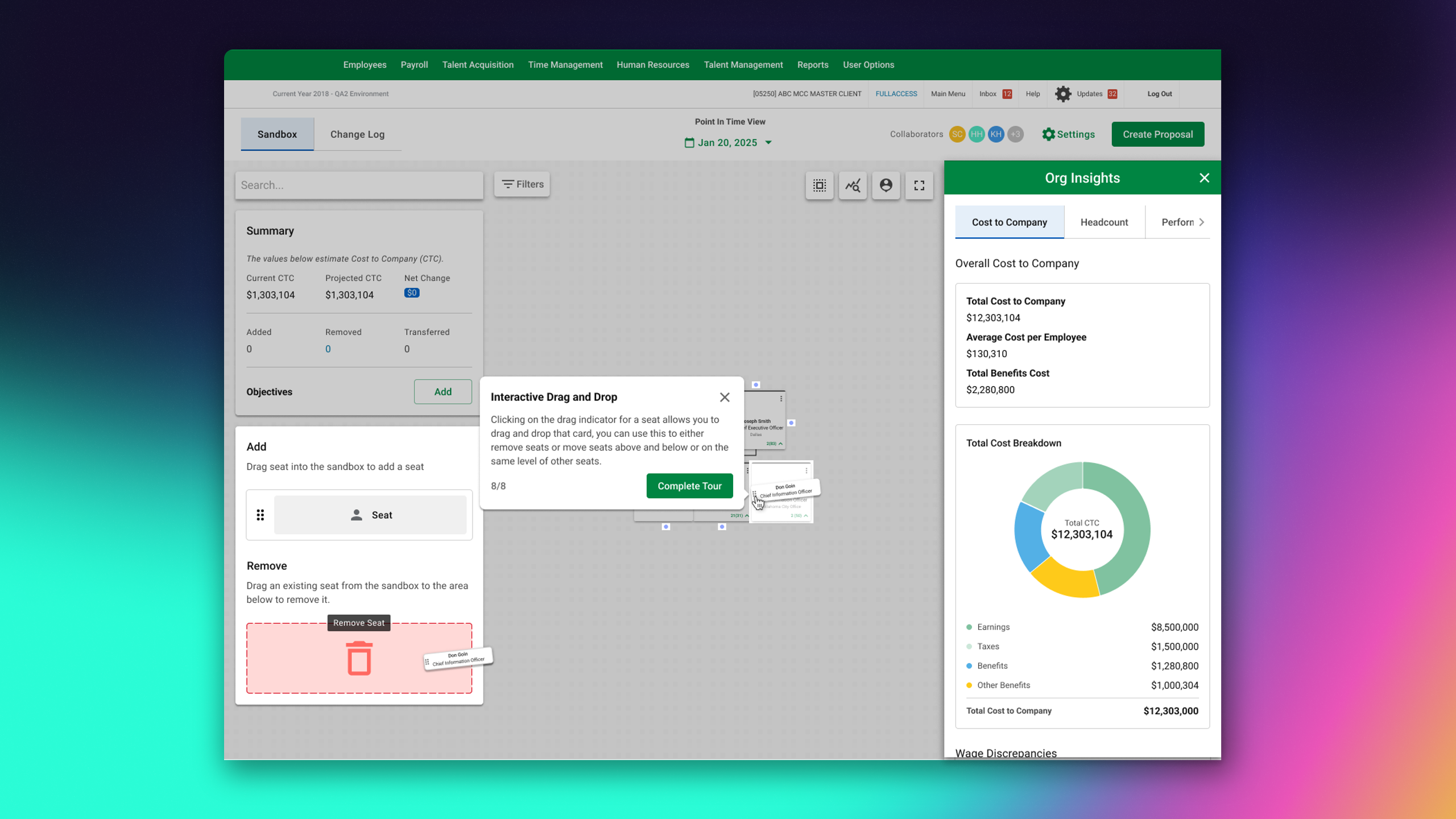
Unified Workforce View
One visualization showing the entire organization — positions, people, compensation, reporting lines — pulled live from across Paycom's modules.
The hard part wasn't the UI — it was the data model. I worked with engineering to define how we'd reconcile conflicting headcount definitions across modules. The answer: show the source. Every number links to where it came from, so users can verify.
Scenario Planning & Comparison
Users create "what-if" scenarios — add positions, restructure teams, adjust compensation — and see financial impact instantly. Multiple scenarios can be compared side-by-side.
The Interaction That Took 3 Iterations
The first version let users type changes into a table. Too slow.
The second version used a modal for each change. Too many clicks.
The third version — direct manipulation on the org chart with inline editing — finally felt right. Users drag a position, see the financial impact update in real-time. The mental model matched the task.
Financial Impact Dashboard
Real-time projections tied to organizational changes. Budget implications, headcount costs, and compensation analysis update as users model scenarios.
Key decision: I chose to show financial impact as a persistent sidebar, not a separate screen. Users needed to see the consequences of their changes without losing context. This meant the org chart had to work in a narrower viewport — a constraint that improved the design.
Data Refresh Notifications
When underlying data changes (new hire, promotion, termination), users get notified and can reload without losing their scenario work.
This pattern came from Position Management, where I'd solved a similar problem. Multi-user awareness matters when your planning is based on live data — you need to know when the ground shifts.
The Toughest Decision
Do We Ship Incomplete, or Wait for Perfect?
4 months in, we had a working product but gaps in edge case handling. Large orgs (5,000+ employees) had performance issues. Some compensation scenarios didn't calculate correctly.
Option A: Wait 2 more months to fix everything. Option B: Ship to select pilots, fix issues based on real usage.
I advocated for Option B, with a critical condition: transparent communication with pilots about what was and wasn't working. We weren't hiding limitations — we were learning with customers.
Result: Pilots found issues we never would have anticipated (multi-entity structures, unusual compensation models). The feedback loop was worth more than 2 months of internal testing.
Communication as Design
With multiple Senior PMs, a Director, and engineering leadership involved, alignment was everything. I created decision documents for every major choice:
- Problem statement — The specific question being answered
- Proposed solution — Clear description with rationale
- Alternatives considered — What else we explored
- Consequences and trade-offs — Honest downsides
- Status — Accepted, rejected, or needs discussion
This transparency built trust. When stakeholders disagreed, we had a shared artifact to reference instead of rehashing context.
Results
Quantitative
| Metric | Before | After |
|---|---|---|
| Time to start planning | 2+ weeks | 3-4 hours |
| Data freshness | Stale on export | Always live |
| Scenario comparison | Manual side-by-side | Built-in |
| Cross-module data access | Export/combine | Unified view |
Qualitative
- 3+ market segments actively piloting
- Eliminated spreadsheet dependency for planning workflows
- Cross-module patterns established that influenced other Paycom products
"For the first time, I can show the board a workforce plan that I actually trust. The data is live. I'm not caveating everything with 'as of last Tuesday.'"
What I Learned
In complex organizational environments, how you communicate decisions matters as much as the decisions themselves. My decision documents weren't bureaucracy — they were alignment tools that prevented months of rework.
Pilots aren't beta testing. They're collaborative design. The customers who used our incomplete product taught us more than internal stakeholders ever could.
Users didn't ask for more capabilities. They asked to trust the capabilities we offered. Every feature that didn't build confidence was a distraction.
I'd involve pilot customers earlier — not at month 4, but month 2. Even with wireframes, their feedback would have accelerated our understanding of edge cases. I optimized for internal alignment when I should have optimized for external validation.
What's Next
Currently measuring pilot usage and gathering feedback for V2:
- Large org performance optimization (5,000+ employees)
- Multi-entity support for complex corporate structures
- AI-suggested scenarios based on industry benchmarks
- Integration with financial planning systems
Gallery


