Life OS Mobile
The pocket half of Life OS: capture a task in one plain-language line, see your day at a glance, and plan with an AI assistant that runs on your own key.
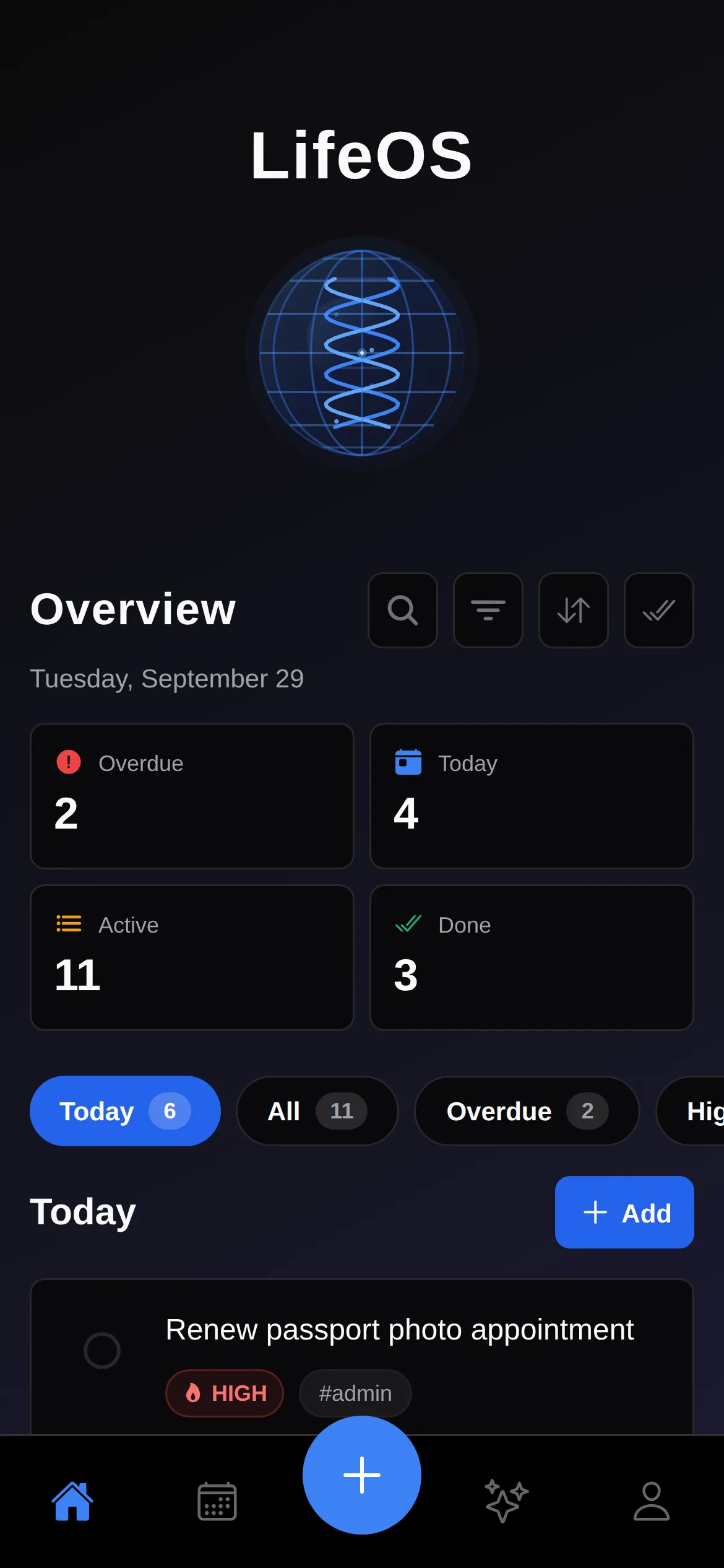
Four counts answer "how is my day going?" before you read a single task.
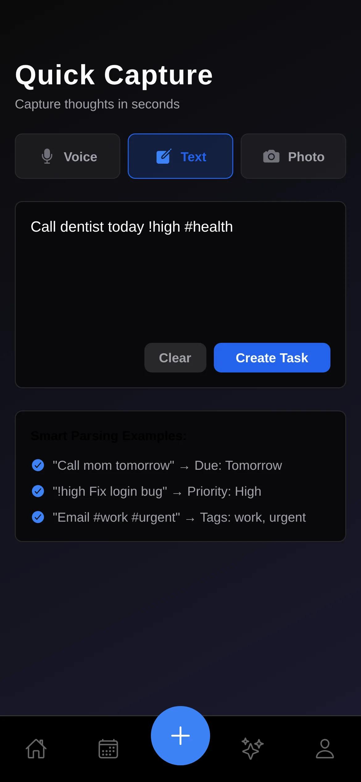
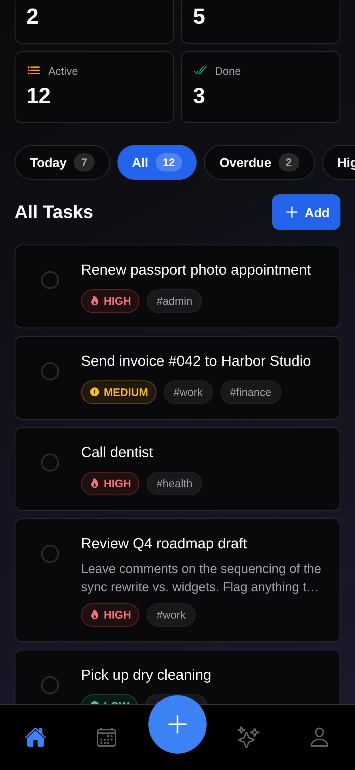
Desktop Life OS is where I plan. This is where I catch things. I designed and built a React Native app around one number, the seconds between having a thought and having it saved. Type "Call dentist today !high #health" and it becomes a high-priority task tagged #health, filed under Today. Around that core loop sit a glanceable Home, a calendar, voice and photo capture, and an AI assistant that runs on your own API key. Every screen here is the real app running with fictional data.
A Different Product, Not a Smaller One
Life OS on the desktop is built for deep work: planning, notes and long sessions. But most tasks show up away from a desk, while walking, cooking or sitting in a meeting. Shrinking the desktop app onto a phone would have kept all its depth and lost the one thing mobile needs, which is speed.
So the mobile app has a narrower job: capture the intention, then get out of the way. Get the thought out of your head and into the system as fast as possible, and do the real work on the desktop later. Every decision below is measured against time-to-capture.
Home: Your Day Before You Read It
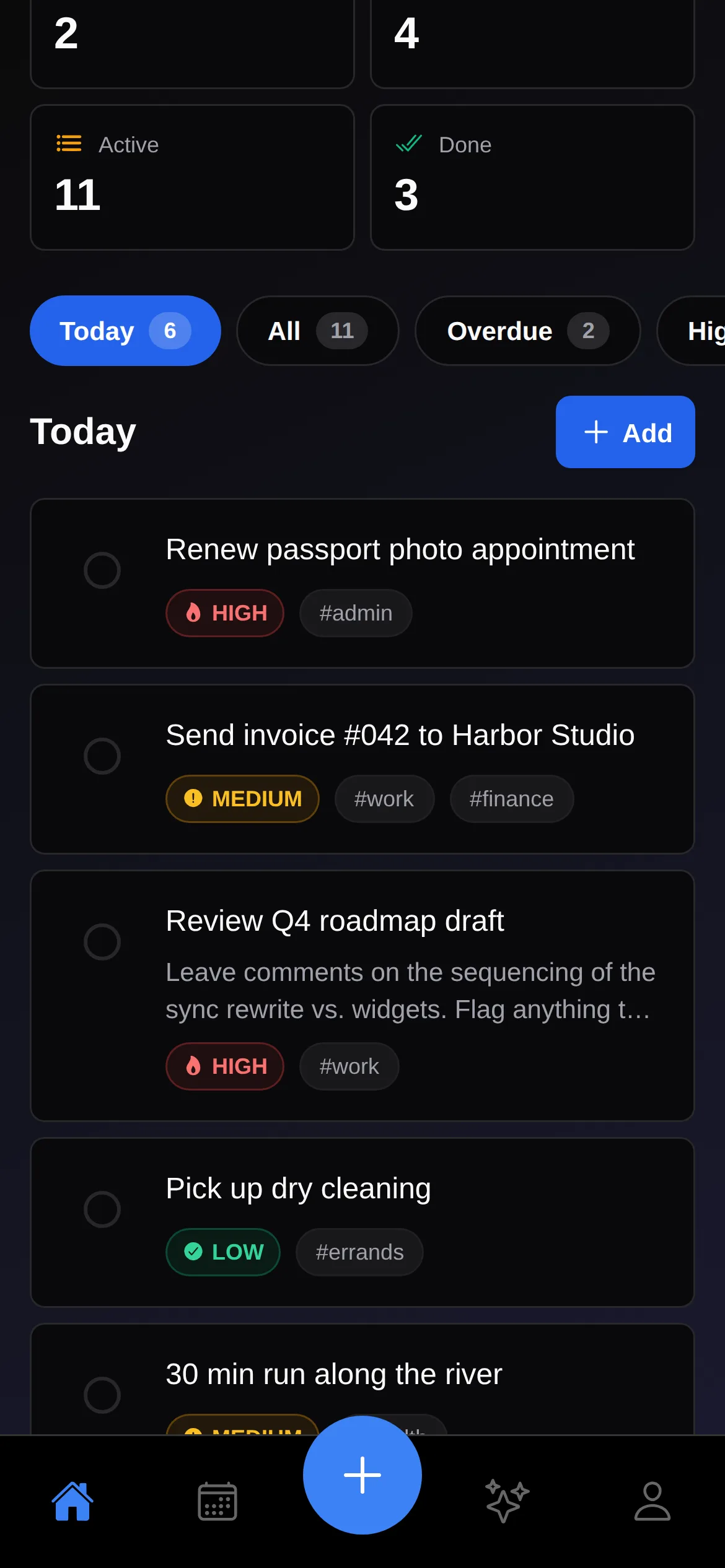
Home opens on four numbers: Overdue, Today, Active and Done. They answer "how is my day going?" before you read a single task. Below them, filter chips switch between Today, All, Overdue, High Priority and Tagged. Today always puts overdue tasks first, so the most urgent thing is at the top.
Capture in One Line
Capture sits in the center of the tab bar, raised and larger than every other tab, because it's the reason the app exists. Instead of a form with a date picker, a priority dropdown and a tag field, there's one text box that understands plain language.
The parser is intentionally small, about a hundred lines, and predictable:
- Dates: "today", "tomorrow", "tonight", "next week", "this weekend" or a weekday name like "friday". With no date word, the task defaults to today.
- Priority:
!high,!mediumor!low. The default is medium. - Tags: any
#word, as many as you like. - Title: whatever is left once those tokens are removed.
The examples under the text field teach that syntax in place, so there's no onboarding to sit through. Here's the whole loop in one take:
Quick Capture end to end: type a sentence, create it, find it in Today, check it off (26s, real app)
Text is the fastest mode, but not the only one. Voice capture records and hands the audio to Whisper. Photo capture sends a picture of a whiteboard or receipt to Google Cloud Vision for OCR. Both use keys you add yourself, and until you do they explain exactly what's missing instead of failing silently.
An Assistant on Your Own Key
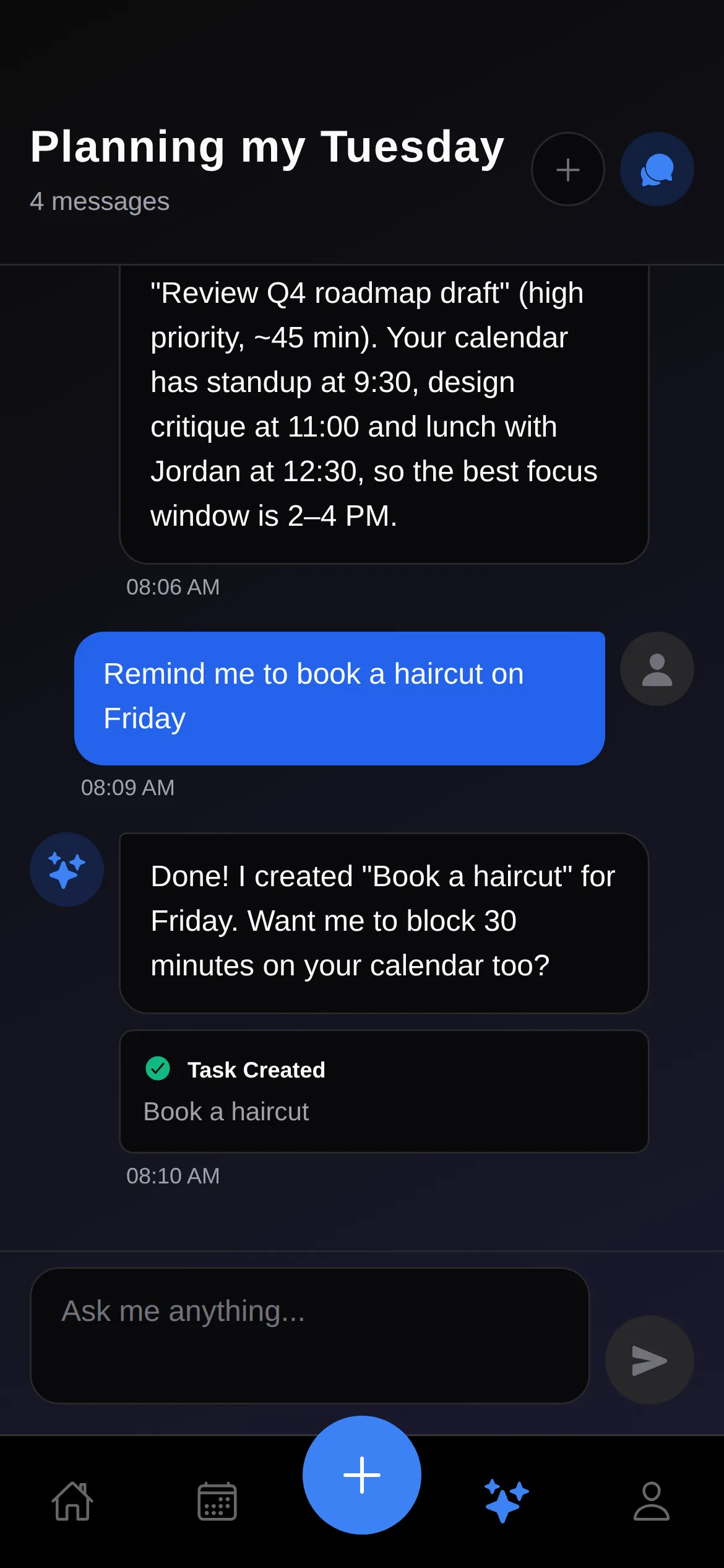
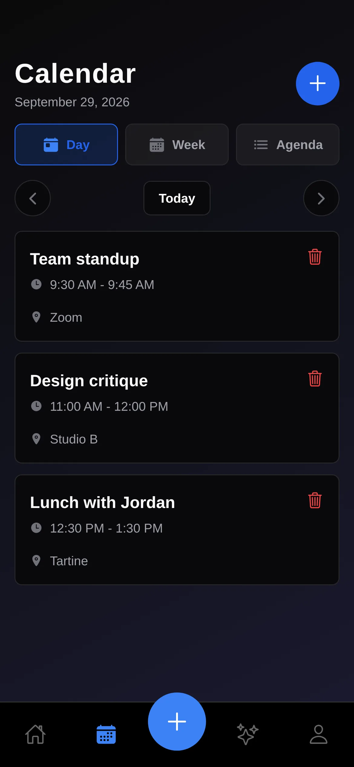
The AI chat can read your tasks and calendar and act on them through five tools: create a task, update a task, search tasks, create an event and list what's coming up. Ask it to plan your Tuesday and it suggests a focus window. Ask it to remind you about a haircut and a "Task Created" card shows up right in the conversation.
I chose Bring Your Own Key over running a backend. You pick OpenAI, Anthropic or Groq and paste your own key, which is stored only on the device. That keeps your data between you and the provider you chose, avoids any markup on AI costs, and lets you switch providers any time.
The Rest of the App
- Notifications: task reminders an hour before they're due, event reminders 15 minutes before they start, and a morning digest (9:00 by default).
- Offline-first: tasks live on the device first, so capture never waits on the network. Supabase handles accounts, with a schema shared with the desktop app.
- Dark-first: near-black gradient backgrounds, a single blue accent, and priority colors that double as icons (flame for high, alert for medium, check for low).
- Touch targets: every tappable element is at least 44px.
What's Next
Walking through every screen for this write-up showed me where the build still falls short of the design:
- Show the parse before you save. Today you find out what the parser understood only after the task lands. A live preview of the date, priority and tags while typing would close that loop, and the parser should learn clock times ("3pm").
- Put the date on the card. Due dates decide which bucket a task lands in but don't appear on the card or the detail view yet.
- Finish sync and widgets. The sync engine (last-write-wins, retry queue, 30-second cycle) and the widget data layer are written but not yet wired into the app, so the phone doesn't push changes to the desktop yet.
I started out planning to port the desktop UI. Once I accepted that the desktop is for planning and the phone is for catching and glancing, the design got dramatically simpler.
One text field that understands "tomorrow !high #work" is faster than any combination of pickers and dropdowns. People type the way they think, so the input should adapt to them.
Voice and photo capture need keys the app can't provide. Explaining that in place, instead of hiding the feature or failing silently, keeps the app trustworthy.