Life OS
One offline-first home for tasks, calendar, linked notes, goals, habits and money, driven from the keyboard and connected by a knowledge graph.
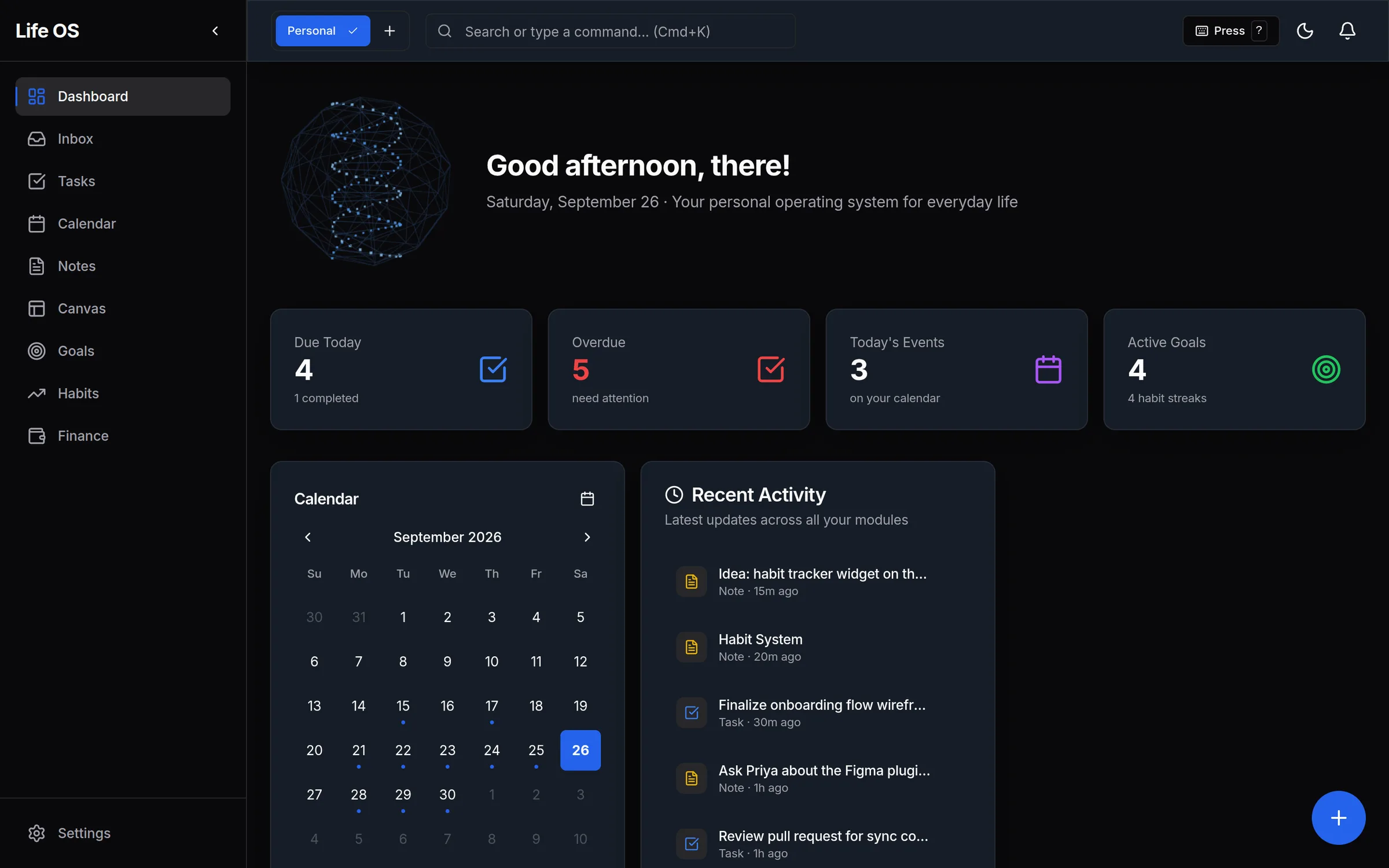
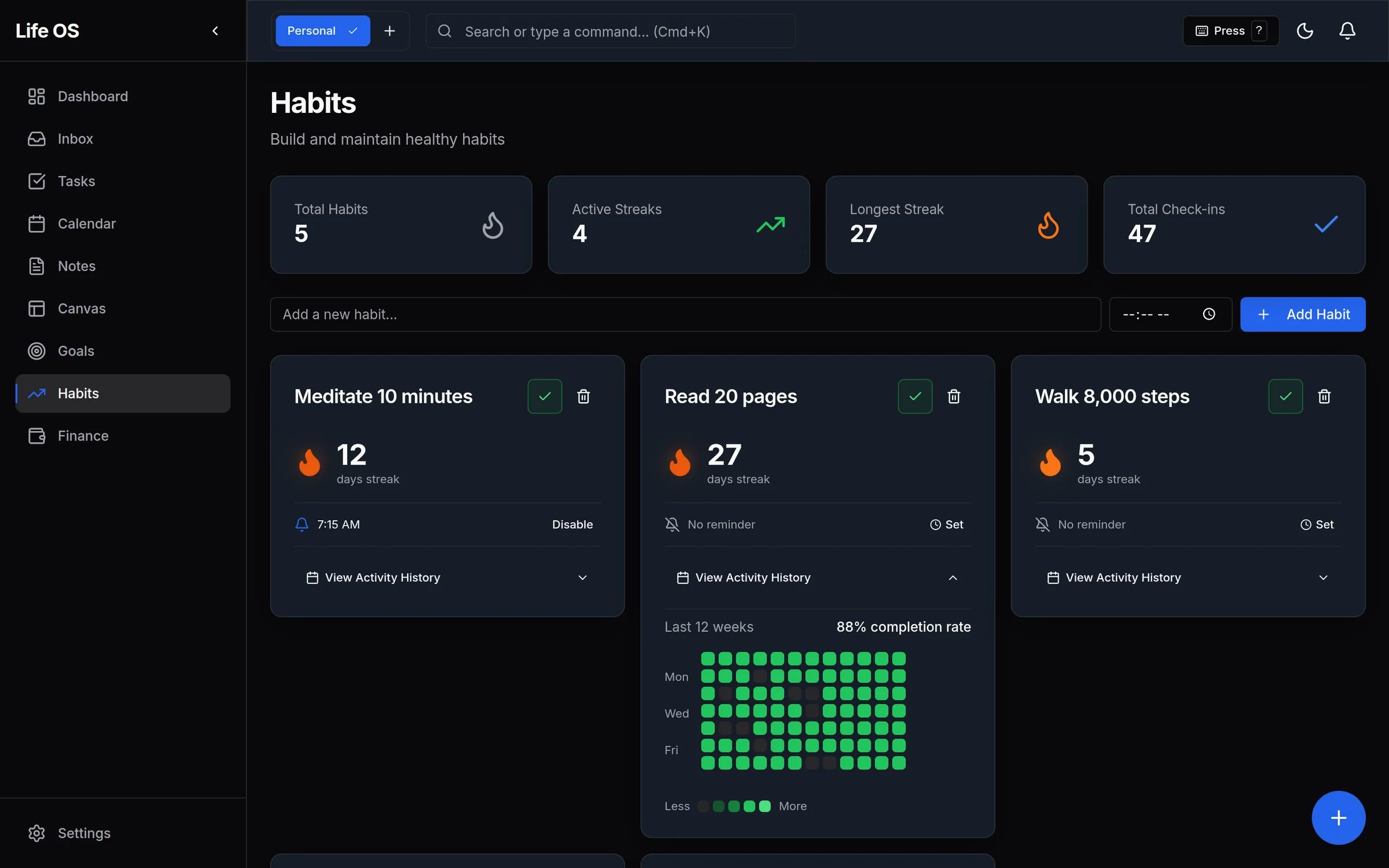
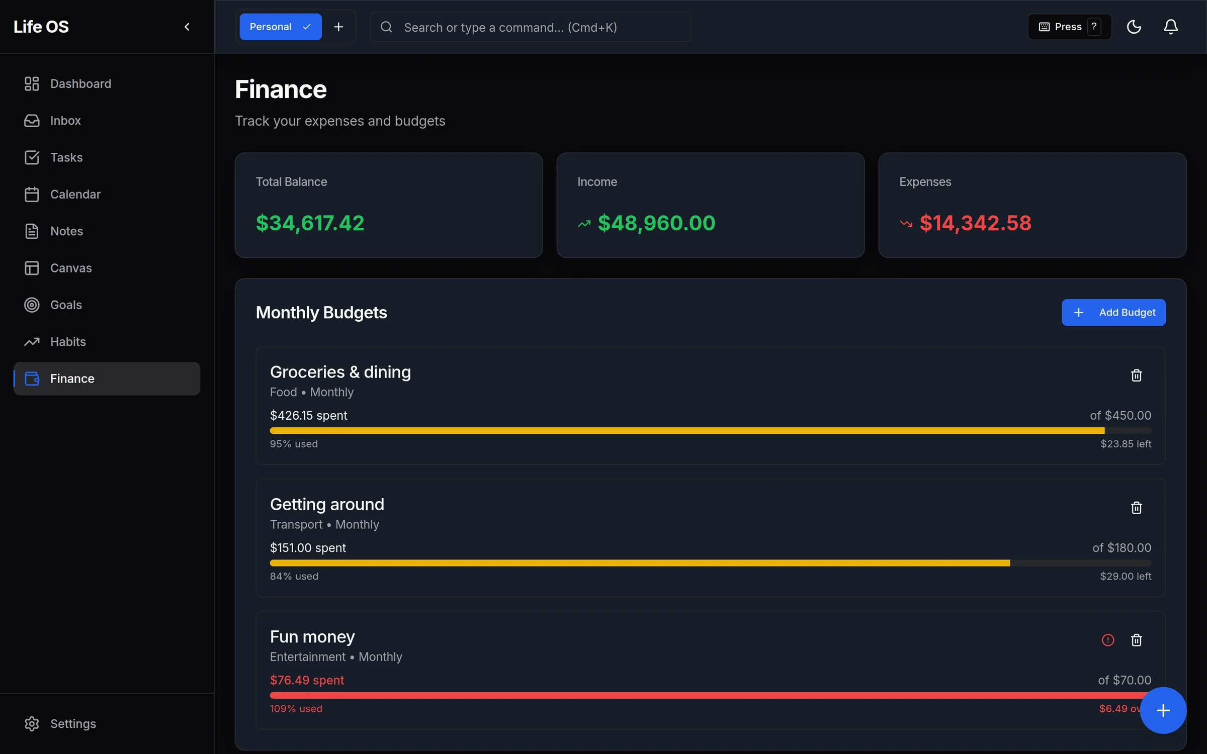
A greeting, four numbers that matter today, the month and what changed recently.
I was running my life across five apps that didn't talk to each other. Life OS pulls tasks, calendar, notes, goals, habits and finances into one keyboard-driven app that stores everything in the browser first, so it works with no account and no connection. The notes are what I'm proudest of: type [[ to link one idea to another, and a knowledge graph shows how your thinking connects. Every screen here is the real app running with fictional data.
Why I Built This
Every tool I tried covered one slice of my life: one app for tasks, another for the calendar, Obsidian for notes, a spreadsheet for money and something else for habits. None of them talked to each other, and all of them kept my data on someone else's servers. I wanted one system I owned, one that works on a plane.
The design bar came from Linear: fast, dark-first, keyboard-driven, and calm enough to live in all day.
One Home for Everything
The dashboard answers "what does today look like?" before anything else: what's due, what's overdue, today's events and active goals, with the month alongside and a feed of what changed recently. Each module keeps its own accent color, so you always know where you are.
Capture Now, Sort Later
The fastest way to lose a thought is to ask where it goes before you've written it down. So the app splits capture from organizing. Press C anywhere, type and press ⌘↵. The item waits in the Inbox until you're ready to turn it into a task, a note or an event.
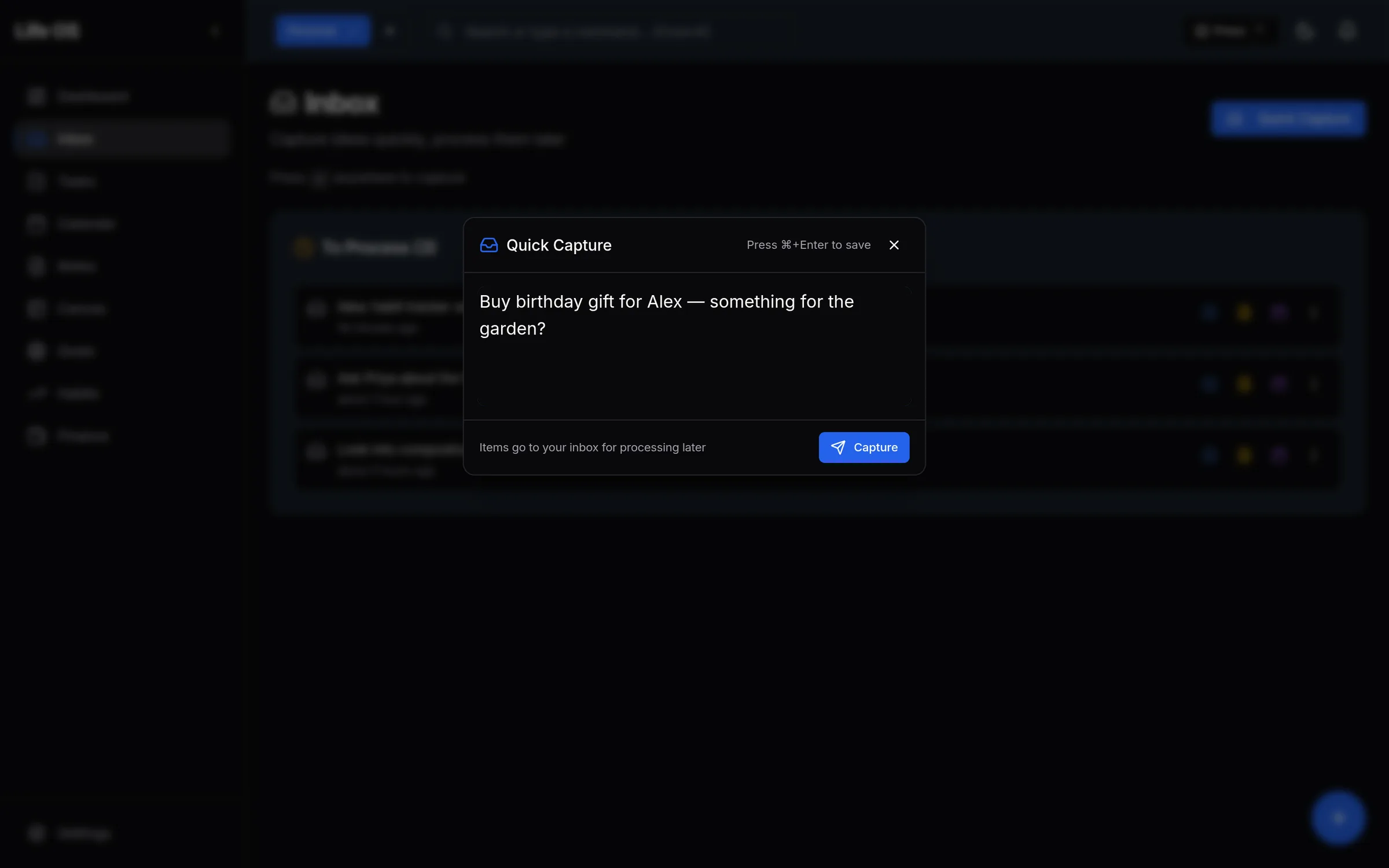
The interaction model is keyboard-first:
- ⌘K opens a command palette that reaches every module and action.
- G then a letter jumps straight to a module, for example G then T for Tasks.
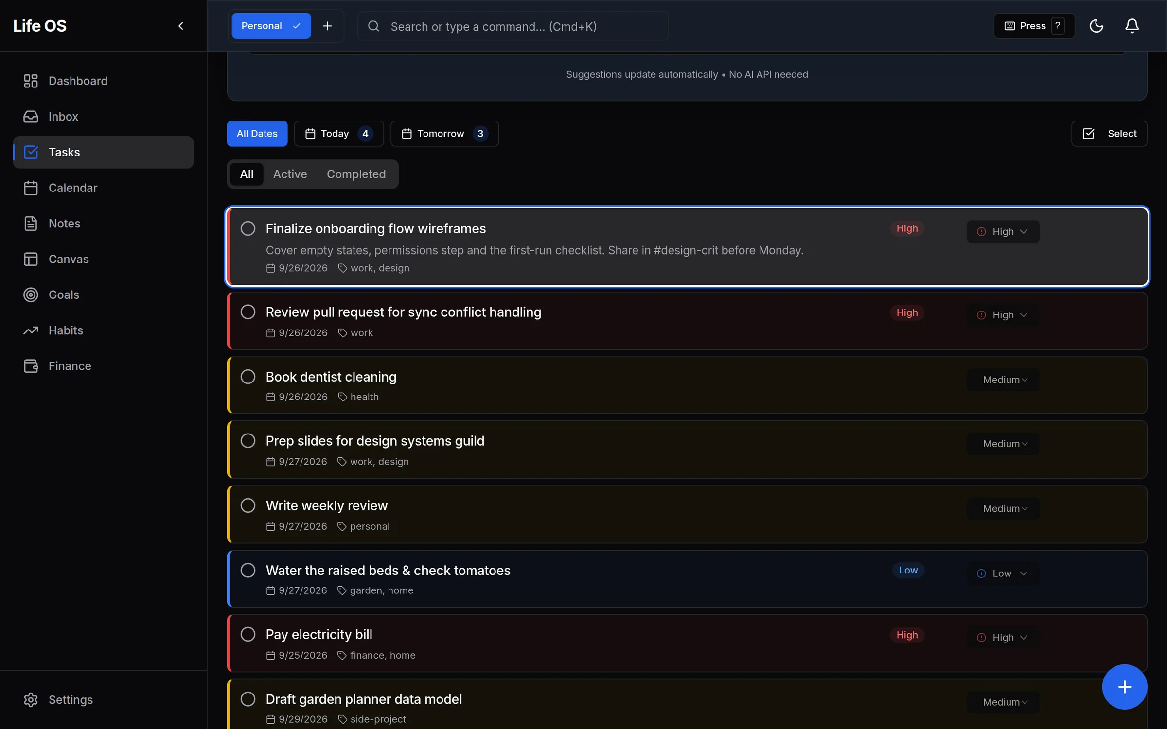
- J / K / X / E / D move through, complete, edit and delete tasks.
- ? shows every shortcut.
Task suggestions are rule-based, not AI. "What should I work on?" ranks by deadline, priority and estimate, so it works offline and costs nothing.
Notes That Connect
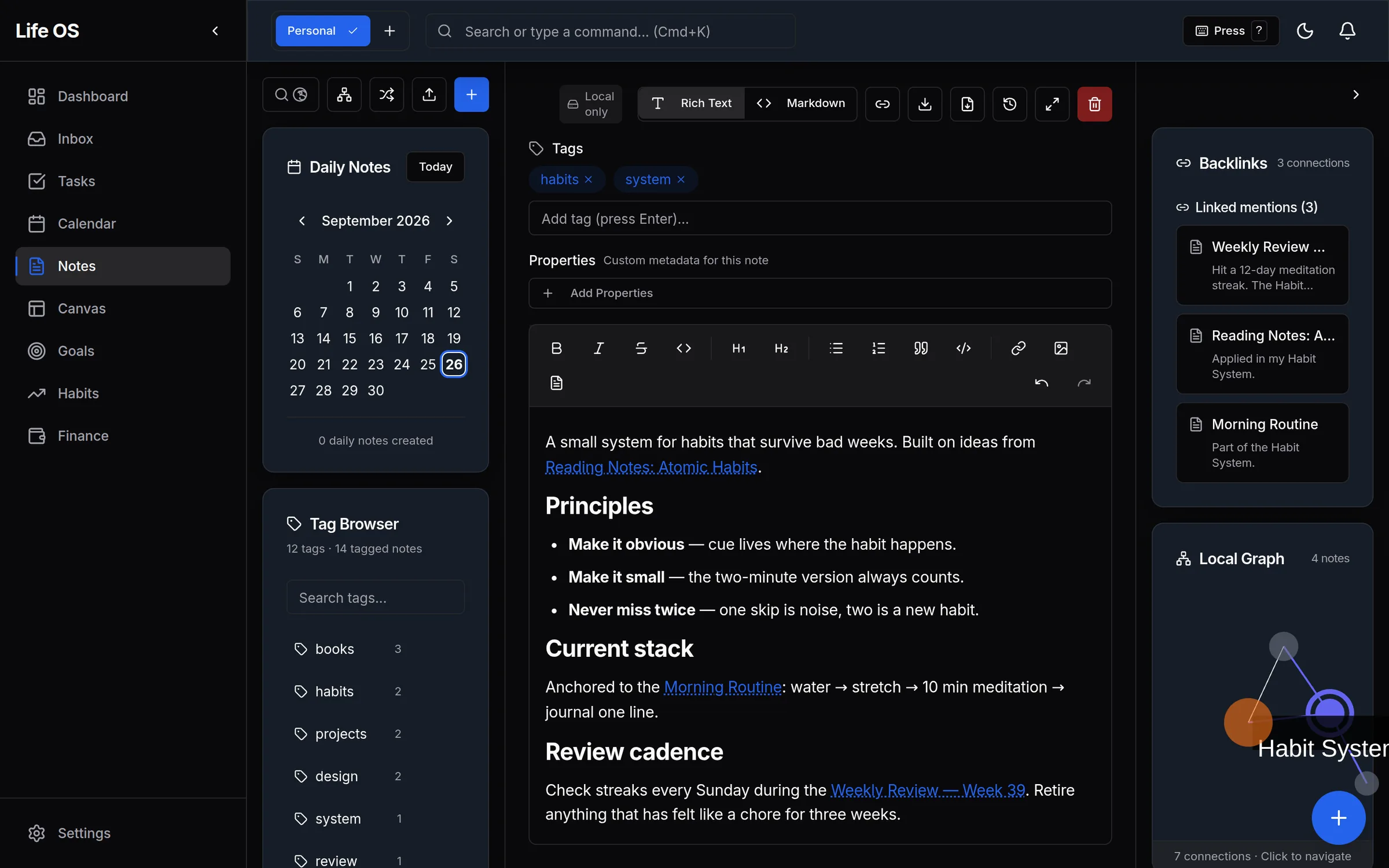
This is the module I'm proudest of. Notes are rich text with wiki-style links. Type [[, pick a note, and the link lands inline. Every note shows its backlinks, the notes that point to it, and a small local graph of its neighborhood.
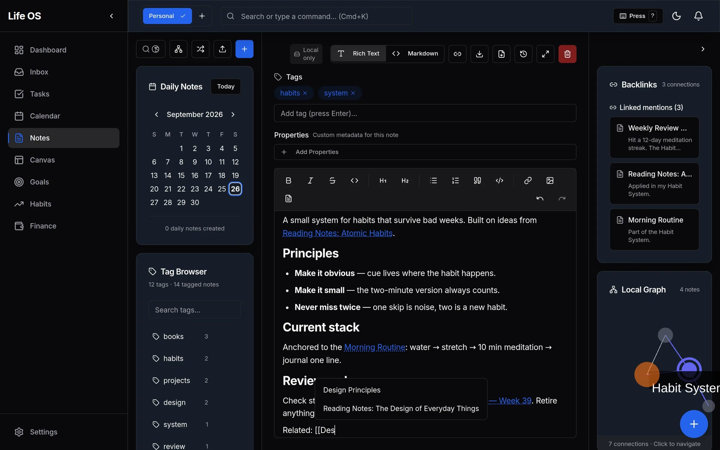
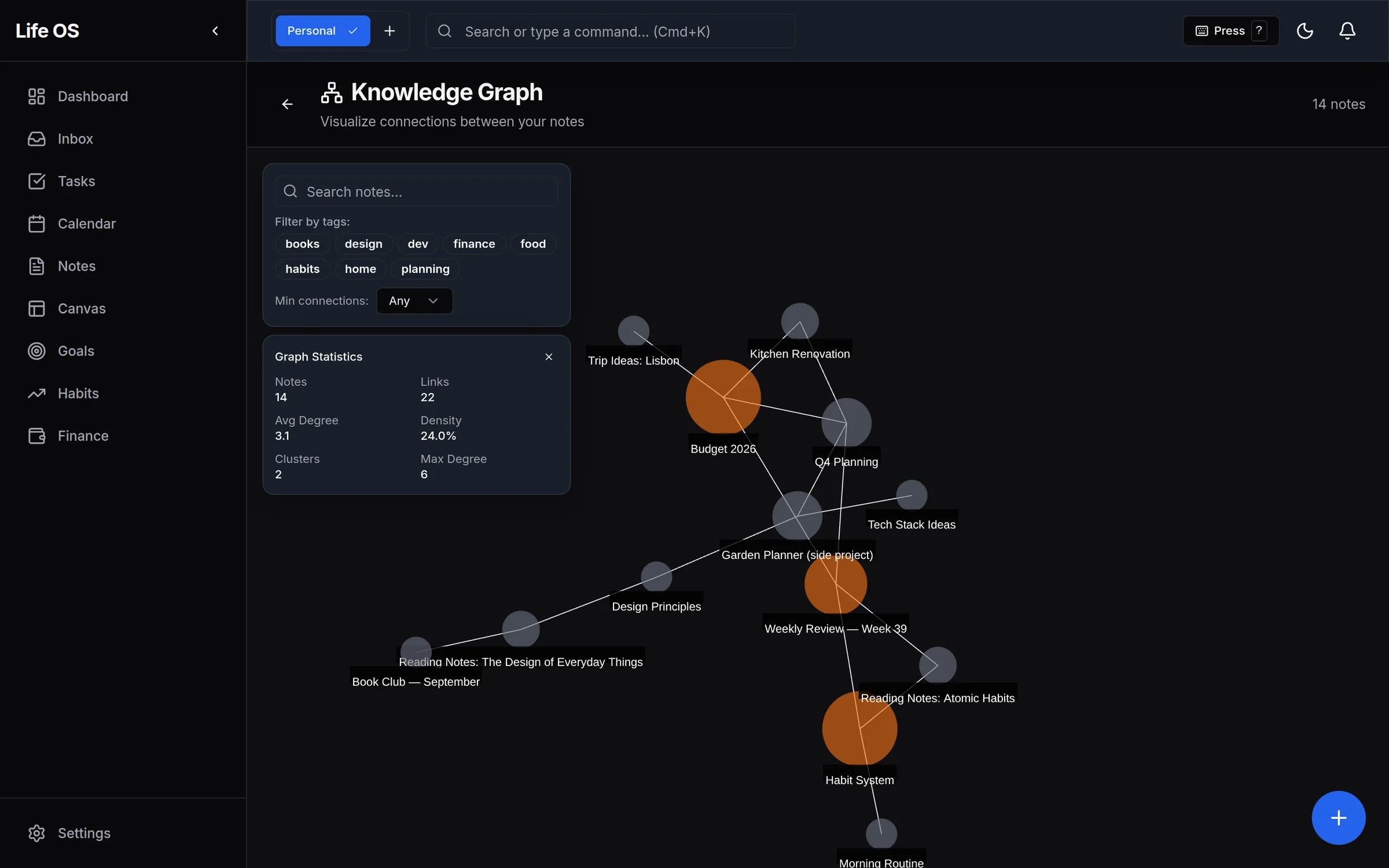
The full knowledge graph is a force-directed map of every note. Hubs draw larger and orphans stand out, which turned out to be the most useful part: a note with no links is usually a thought I haven't finished.
Here's the whole loop in one take: capture, triage with the keyboard, add a link, and watch the graph's link count go from 22 to 23.
Quick capture, keyboard task triage, a [[link]] and the graph updating from 22 to 23 links (50s, real app)
Offline-First, For Real
Every read and write goes to a local database in the browser (IndexedDB, through Dexie) first. The UI never waits on a network, so there are no spinners for your own data. With the connection cut, an Offline badge appears and everything keeps working. A service worker caches the app itself.
The cloud is opt-in. Accounts only switch on behind a feature flag, and notes sync to Supabase when you share them, not before. Each note carries a small "Local only" badge until then, so you always know where your data lives. A hybrid local-plus-cloud storage layer is built and waiting for full sync.
Design System
- Dark-first and HSL-tokenized. One primary blue,
hsl(221 83% 53%), in both themes, a near-black background, and a five-color chart palette. - Motion with restraint. 150–250ms springs: cards lift 2px on hover, buttons press to 98%, and the command bar scales in with a 50ms stagger.
- Empty states that teach. The first-run notes screen explains linking instead of just saying "nothing here".
- Light theme too. It's supported everywhere, and building it exposed one bug: graph labels become unreadable in light mode, so that's next.
What I Learned
When every write is local, there are no loading states for your own data and no error states for a flaky connection. The app just responds, and that feels different from almost everything else on the web.
I expected the graph to be decoration. It became a tool: clusters showed ideas I hadn't consciously connected, and orphan notes pointed at thoughts I hadn't finished.
Wiring shortcuts through every module took real effort. Now I rarely touch the mouse, and it's the kind of polish that separates tools you tolerate from tools you love.